
River hysteresis and plotting hysteresis data in R
Introduction
Hysteresis is the concept that a system (be it mechanical, numerical, or whatever else) is dependent of the history of the system, and not only the present conditions. This is the case for rivers. For example, consider the following theoretical flood curve and accompanied sediment discharge curve (Figure 1a).
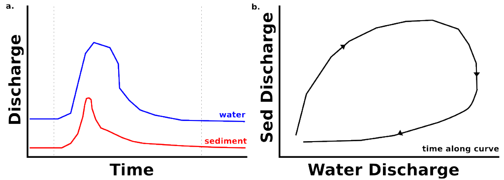
With the onset of the flood, the increased sediment transport capacity of the system entrains more sediment and the sediment discharge curve (red, Figure 1a) rises. However, the system may soon run out of sediment to transport (really just a reduction in easily transportable sediment), and the sediment discharge curve decreases although the water discharge curve remains high in flood.
In Figure 1b, the sediment discharge and water discharge are plotted through time, a typical way of observing the hysteresis of a system. Note that for the rising limb and falling limb of the river flood, the same water discharge produces two different sediment transport values.
Now, let’s imagine that we want to investigate how important the history of the system is to the present state of our study river. You can grab the data I’ll use, here. This is data from one year of flow on the Huanghe (Yellow River) in China, and it has been smoothed with a moving average function to make the hysteresis function more visible.
Making the plot
It is easy enough to plot a line with R (the lines function) but with a hysteresis plot, it is important to be able to determine which direction time is moving forward along the curve. For this reason we want to use arrows. So we plot the line data first, with:
lines(df[1:366,"Qw"],df[1:366,"Qs"],
      lwd=2,
      )
and then using a constructed vector of every 22nd number, we plot an arrow over top of the lines using:
s <- seq(from=1, to=length(df[,"Qw"])-1, by=22)

arrows(df[,"Qw"][s], df[,"Qs"][s], df[,"Qw"][s+1], df[,"Qs"][s+1],
       length=0.1,
       code=2,
       lwd=2
       )
Finally, with a few more modifications to the plot (see the full code here), we can produce Figure 2 below. This plot is comparable to the theoretical one above.
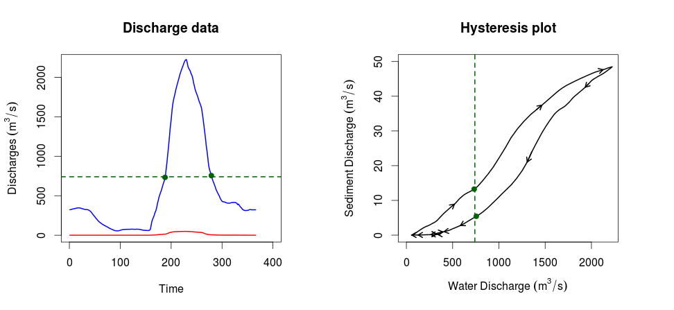
Using the green lines and points, I have highlighted the observation that for the rising limb and falling limb of a flood, there can be substantially different sediment discharges for the same water discharge. This observation is not so easily made from the plot on the left, but it is immediately clear in the hysteresis plot on the right.